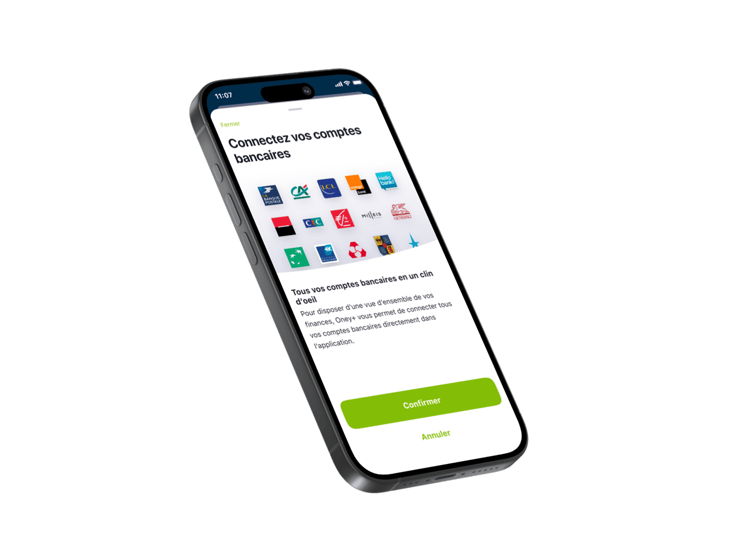
Redesign of the Oney+ Mobile App Design System
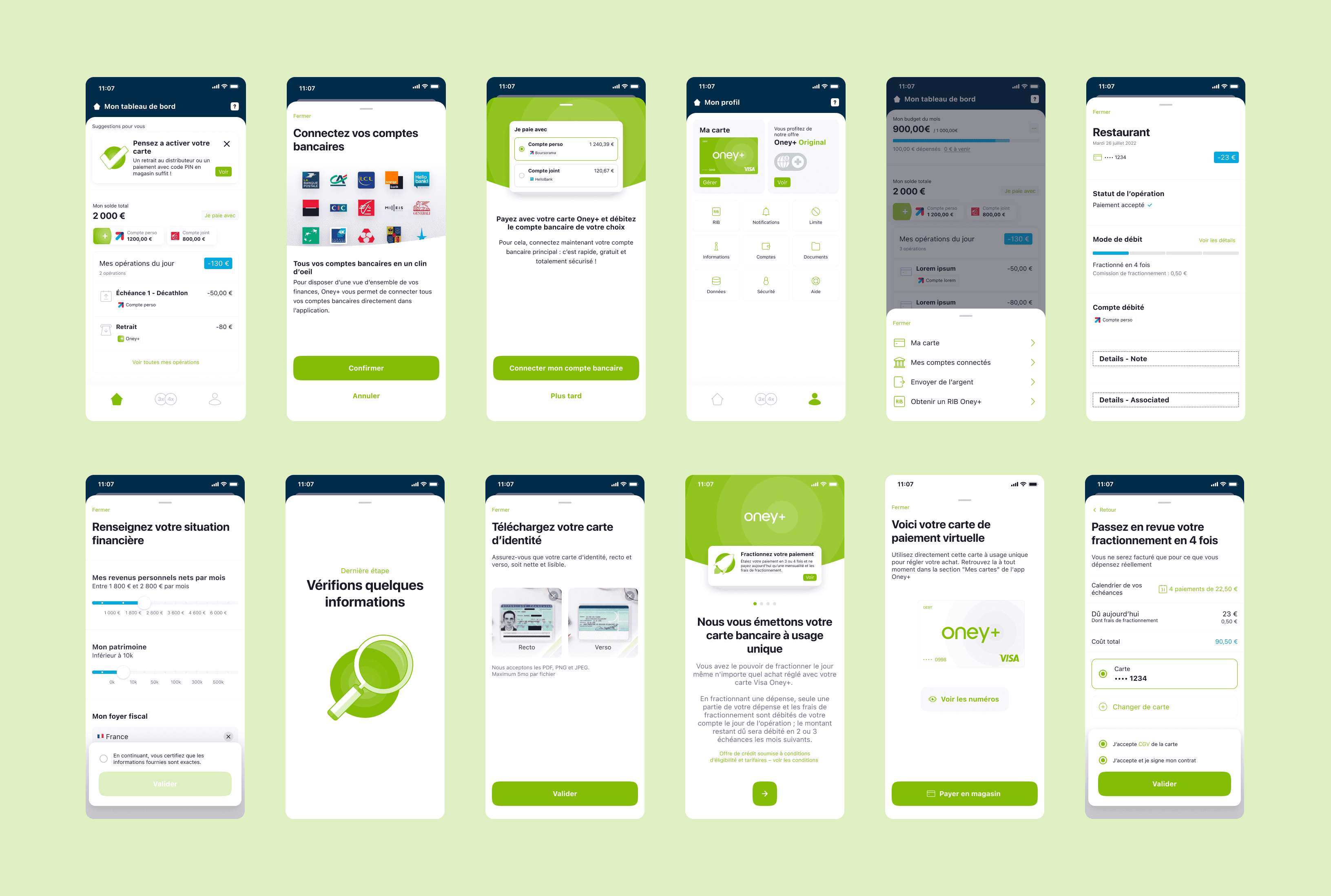
1. Context Industry: Fintech – Consumer Credit Product: Oney+ Mobile App (iOS / Android) Target: B2C – Existing banking customers User base: ~10,000 monthly active users Timeline: Project completed in 2022 Background: Oney+ was undergoing a strategic redesign of its mobile app. The UI lacked consistency and accessibility, and design handoffs were not easily scalable for developers. 2. Team & Organization Structure: Dedicated feature team Team members: 2 Product Owners, 1 Product Manager, 1 squad (~8 developers), 2 QA engineers, 1 freelance illustrator My role: UX/UI Lead – responsible for the design system, associated journeys, and visual coherence Collaboration: Worked closely with PO and frontend developers to build and structure the design system and tech library 3. Goals & Challenges Main objectives: Modernize outdated app interfaces while preserving strict brand elements (e.g., green/white CTA colors, which were non-negotiable) Improve accessibility across key screens (contrast, hierarchy, readability) Standardize and industrialize mockups to speed up development cycles Create a robust Figma design system + mirror tech library for developers Ensure consistent UI across all modules (user profile, card management, split payment options) UX/UI challenges: Reduce usage errors in the card management flows Clarify access to various financial products (split credit, virtual card, etc.) Simplify the profile menu’s information architecture, which users found too dense and confusing 4. Methodology Phases & deliverables: - UX Audit: Identified UI inconsistencies, component deviations, and non-compliance with RGAA accessibility standards - Visual Benchmark: Studied leading fintech and banking apps (N26, Lydia, Klarna) for modern patterns and hierarchy User Testing (with Wexperience): - 2 half-day sessions with 8 users per group - High-fidelity prototypes tested - Qualitative feedback + navigation clarity scoring Design System: - Built entirely in Figma using auto-layout, tokens, variants, and atomic components - Structured documentation and naming conventions for dev integration Collaboration: - Co-scoping and validations with PO - Pair work with frontend devs to ensure pixel-perfect implementation - Illustrator brought in to create a cohesive and modern icon set Accessibility & data: - Applied RGAA standards from day one (contrast ratios, focus states, touch targets) - Prioritized redesigns based on analytics insights and feedback from the Customer Success team 5. Results & Impact Product / dev outcomes: +30% component reusability in subsequent sprints UI-to-dev handoff time reduced by 25% Significantly improved “pixel quality” in QA (fewer than 5% post-dev UI bug tickets) Smoother collaboration between design and dev teams via shared naming conventions and documentation User outcomes: Very positive feedback on interface clarity and visual hierarchy (from both usability tests and customer support) Perceived modernity significantly improved in the card management section "Profile > Card" journey is now unified, cleaner, and more intuitive
Client
ONEY+
DELIVERABLES
Design System Accessibility
Year
2022
Role
UI UX Designer